This isn’t a new sentiment, but still needs to be said… again
What’s Happening & Why This Matters
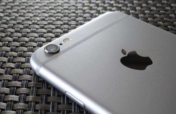
In the sleek world of Apple, where design once reigned supreme under the watchful eye of Jonny Ive, there lies an aberration that many of us can’t seem to overlook: the iPhone camera bump. It’s a protrusion… a necessity for the phone’s advanced photography capabilities. Yet an ongoing point of contention for design purists and practical users alike.
The Bump is a testament to how, even design-conscious leaders like Apple, sometimes compromise aesthetics for functionality.
A Design Dilemma: Function vs. Form
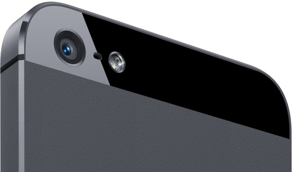
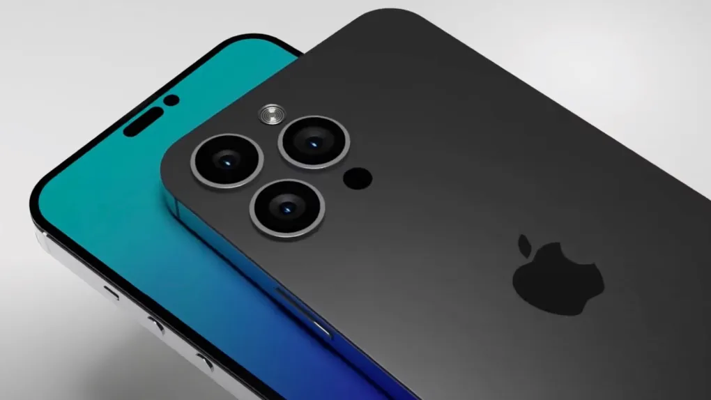
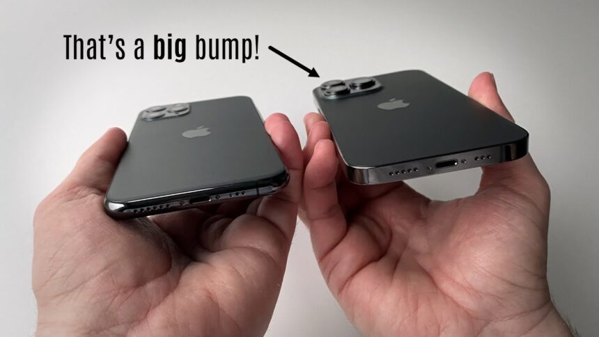
Our friend, Jon Prosser (Sept 2021), shared “details” about the then-rumored iPhone 14 via Front Page Tech website. The rumored design followed Apple’s design adjectives: clean, sleek, elegant, minimalist. When the 14 launched in Fall 2022 — there was the bump like the 13, 12, 11, 10 before — larger than previous iterations. The current iPhone 15 (launched Fall 2023) possesses an even larger bump not to buck the trend.
The camera bump — introduced to accommodate the iPhone’s ever-evolving camera technology — continues to irk many because it marks Apple’s departure from its minimalist design ethos. The Bump not only breaks the phone’s smooth lines but also presents practical, every day annoyances. It cannot be placed flat on a table or avoid snagging in a pocket. It’s a far cry from the seamless designs that Steve Jobs and Jonny Ive championed. Every element of a Jobs-Ive product had its place — both form and function.


The Bump is a significant shift in iPhone design philosophy. The Bump emphasizes camera performance over the uninterrupted sleekness of the device’s silhouette. While each iPhone touts advancements in image censor, quality, depth, and speed (which are worth celebrating), the “physical manifestation of this progress leaves something to be desired”.
It’s like wearing a beautifully tailored suit… with bulky keys hanging from your belt. The suit is functional, yes. But the keys just do not belong. Insert an analogy you want here… it’ll probably work.
The Impact of Ive’s Departure
Steve Jobs died on 05 October 2011. Ive continued to oversee design until his 2019 departure from Apple. Ive’s leave left many wondering about the future direction of Apple’s design. Ive quipped to the New York Times, that he was leaving Apple to the “accountants” implying profitability outweighed high-quality experiences. With products post-Ive still bearing the camera bump and even expanding it in some models, it’s clear that Apple’s design priorities have evolved.
The question remains whether this shift signifies a permanent departure from Ive’s minimalist legacy OR if it’s merely a phase in Apple’s design journey.

Beyond aesthetics, The Bump challenges the practicality of iPhone usage. The quest for compatible cases that don’t make your phone look like it’s wearing an oversized backpack. The delicate dance of placing your phone down without a symphony of wobbles highlights its inconvenience. I
t’s a small but constant reminder that design compromise can sometimes lead to daily irritations.
t/f Summary: What’s Next
As we navigate the era of the camera bump, it’s clear that Apple’s design trajectory is in a state of flux. How doe you balance the innovative demands of technology and the foundational principles of aesthetic simplicity.
The Bump may be here to stay (for now), I hope that future IPhone component engineers find a way to reconcile this design challenge. Perhaps, in time, Apple will unveil a solution that marries the need for advanced camera systems with the Ive-influenced, Jobs-approved designs many yearn for again.
In technology and design, evolution is constant. Nothing is truly set in stone.


